Trailer,Poster & Magazine Analysis
from
|
|
|
|
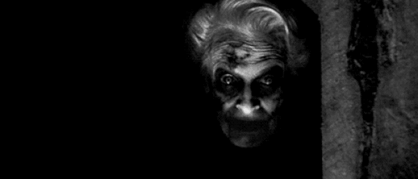
trailer analysis- from watching this trailer i've noticed many typical conventions of horror were used. from the beginning i noticed they used cut to black from early which creates suspense and shows that something is going to happen soon. the fact that the antagonist has key hands could create a lot of fear to humans as keys are supposed to be used to access your safe place so for someone to have the power to control your body with a key is every humans fear. the fact that it brings back the main character from so early helps to rejig our memory of what happened i the previous sequels, so the trailer can make more sense. they also brought back the red door which we remember from previous sequels, this also gives us a warning that whatever is about to come next is dangerous as the door is red and we usually associate red as a danger colour. the doors closing through out the trailer could signify isolation and someone being trapped with no ways to escape as the doors closed behind themselves meaning there must be and evil entity on the other side. we see the most action taking place in the last quarter of the trailer, this is where most of the fear is created as there is so much going on that we don't know where to focus our attention and then something pops up at the last minute. the final scene is of the protagonist encountering one of the antagonists, we then only get to see her feet as she gets lifted off the ground, this being the final scene creates a lot of mystery for the viewer as we now have to watch the movie to find out what happened to her which is a good convention.
|
trailer analysis -from watching this trailer i've noticed many typical conventions of horror were used, similar to the first one there were cut to blacks very early to start of the trailer, creating fear from early in the trailer, the child's voice saying "wanna play" is also another convention that creates fear as it sounds scary and the giggle is frightening. The universal production was put in black and white rather than in colour to make us feel uneasy. When the women sits up in the bed the music stops, this creates tension as we question why the music has suddenly paused. She also looks very scruffy and tired which makes her fit the role of a mental women better.
|
what we may include in out trailer- they used many great conventions and ideas in this trailer and some of them may come in handy in our trailer, for example i like the idea of the antagonist having key hands, because this fear does not apply to any gender in particular, it is a fear that anyone could have. also not showing us the antagonists face could mean that it could be a male or female and thats left for us to guess. also i like the idea of the protagonist getting hurt at the end of the trailer and leaving us to wonder what happens as it makes me more inclined to want to find out whether he/she is okay or not.

Film Title- The Last Exorcism
Genre- Thriller
Release date- August 27
Director- Daniel Stamm
Poster Analysis
Inspirations/whats going to be used
From analyzing this poster, there are many ideas that I would like to incorporate in my own poster, the simplicity of this image is what caught my eye the most, it shows that its not always about how full the page is that makes a picture look scary, the picture is scary enough and too much going on around it would just take attention away from the dominant image making it less eye catching. The next idea that I liked was the hint of red, when it came to specific pieces of text, adding bright color to all the text would of once again be attracting too much attention away from the main image. The last idea I liked was the website name, its very simple and easy to remember and therefore will make more people want to check it out.
From analyzing this poster, there are many ideas that I would like to incorporate in my own poster, the simplicity of this image is what caught my eye the most, it shows that its not always about how full the page is that makes a picture look scary, the picture is scary enough and too much going on around it would just take attention away from the dominant image making it less eye catching. The next idea that I liked was the hint of red, when it came to specific pieces of text, adding bright color to all the text would of once again be attracting too much attention away from the main image. The last idea I liked was the website name, its very simple and easy to remember and therefore will make more people want to check it out.

Inspirations/whats going to be used
The main idea I liked from this image is the meanings behind each object, for example the human standing on the edge of the window with his arms spread apart could represent vulnerability. Another thing I liked was the fact that even though the image is so dark, all the things that need to be seen have enough light to show. The last thing I liked is the contrast of the bright title on such a dark background, it really helps it to stand out against everything else.
Film title- The Conjuring 2
Genre- Thriller
Release date- 13th June 2016
Director- James wan
Poster analysis

Inspirations/ whats going to be used
I like the idea of the protagonist being below the antagonist to show her vulnerability to the monster, this could be a useful touch to my poster, also i like the color scheme they have used (red and black) because these two colors usually signify danger and blood.
I like the idea of the protagonist being below the antagonist to show her vulnerability to the monster, this could be a useful touch to my poster, also i like the color scheme they have used (red and black) because these two colors usually signify danger and blood.
Film title- A nightmare on Elm street
Genre- Slasher/Thriller
Release date- 12th July 1985
Director- Wes craven
Genre- Slasher/Thriller
Release date- 12th July 1985
Director- Wes craven

Inspirations/ whats going to be used
- I like the idea of the girl smearing blood over the wall, it is an unusual convention that many horror posters don't include. Once again I like the simplistic vibe I receive from this poster because even though it is very simplistic it it effective, also I like the positioning of the title and tagline as it is the center of attention.
Film title - Sinister
Genre - Thriller/ Mystery
Release date -
Director - Scott Derrickson
Genre - Thriller/ Mystery
Release date -
Director - Scott Derrickson
Magazine analysis
 |
 |
