Poster & Magazine Drafting
|
|
|
|
|

|
Magazine Drafts
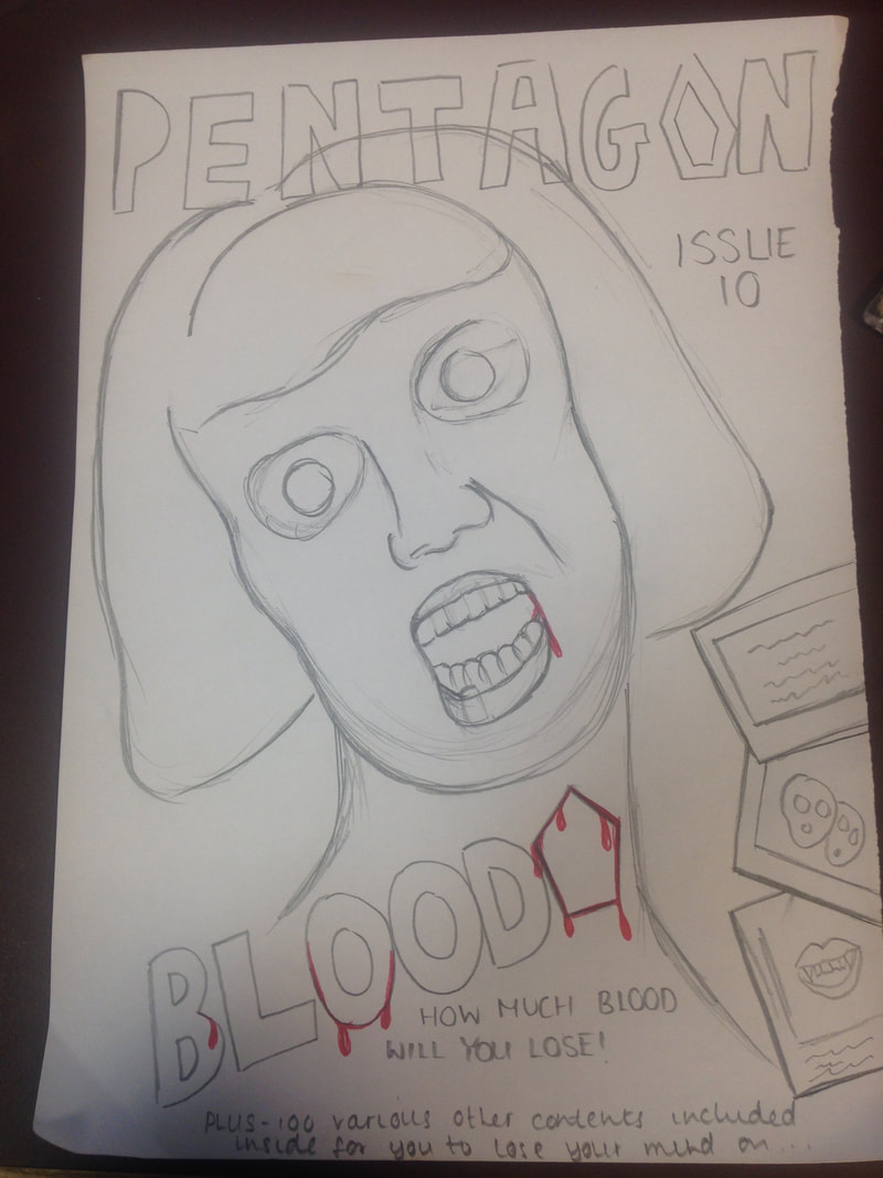
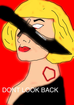
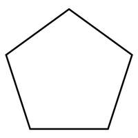
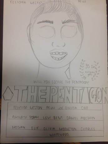
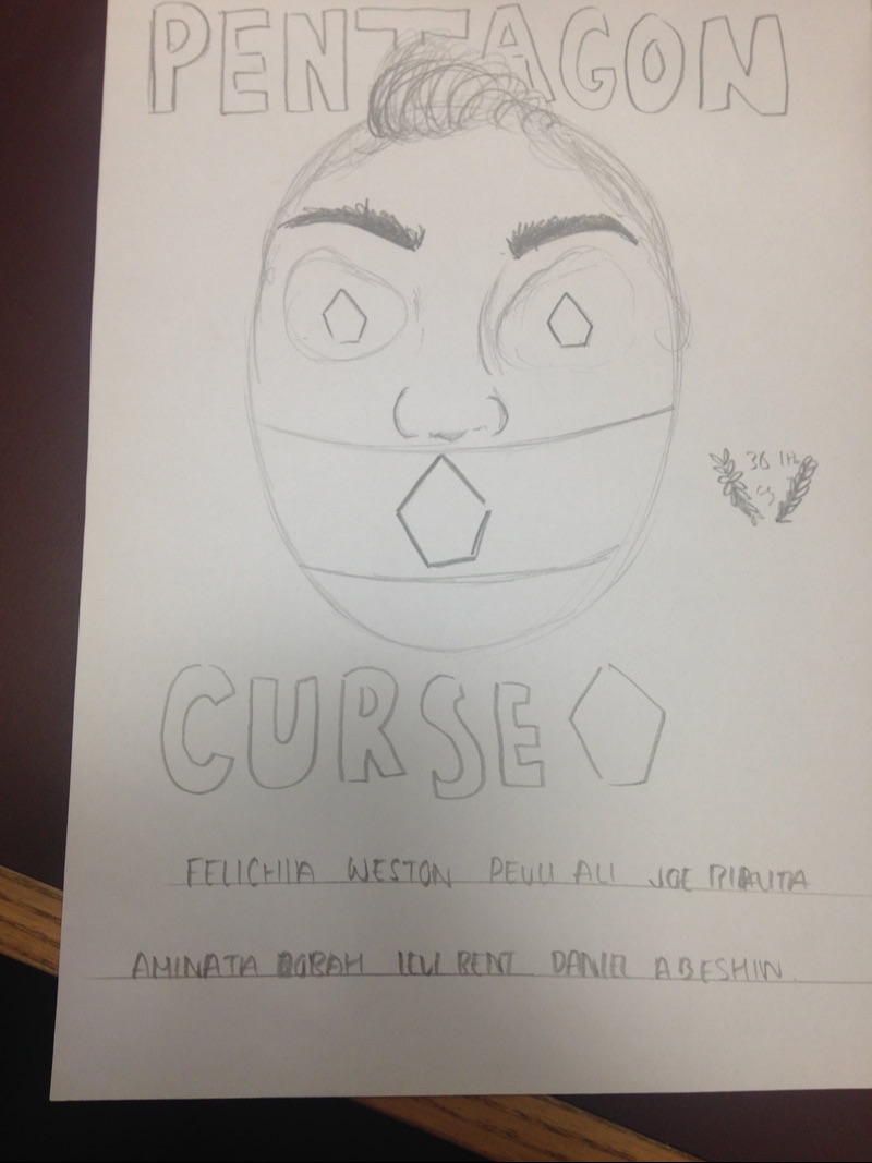
I decided to make the main image a women who has been possessed by the 'pentagon' the pentagon is practically the antagonist in our trailer. The title of our magazine was pentagon however in the last one I decided to change this to 'BLOODY' as pentagon is the personal movies title. I decided to put images and text on the side in little boxes of other scary things featuring in it. I have also mentioned what issue it is to make it clear how many we have.
|
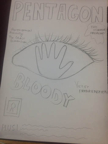
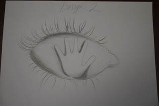
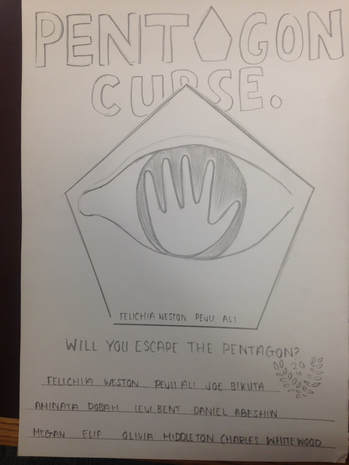
For this one we decided to use the eye with the hand coming through it, this was our initial idea however it is very typical so we came off of that idea. I've included names of other movies in the back ground that could also be advertised. I also decided to put text in a blood splatter to add an extra effect which relates well because the title of the magazine is bloody.
|
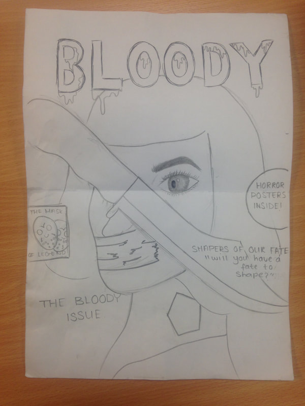
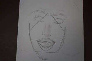
This is personally my favourite design as it contains the most detail and I believe it relates a lot to our trailer design, I believe I have put the text in very thoughtful positions making it more eye catching. The title is dripping blood which I think will add excitement to the magazine and make it more appealing.
|
Poster Drafts
|
|
|
Digital Drafts